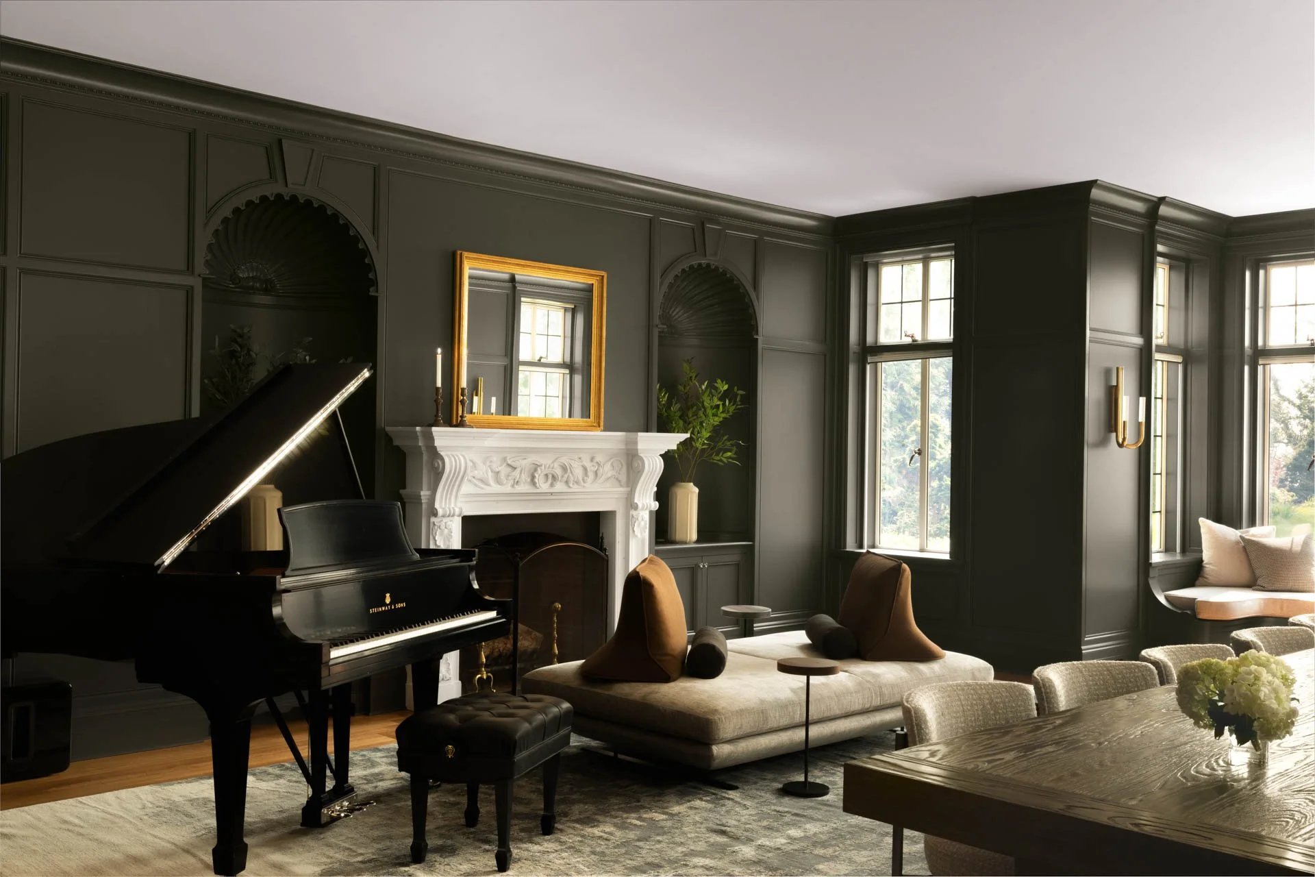
A Sound Connecticut Escape
Nestled at the edge of the Long Island Sound, this summer house blends family history with modern livability. Photography courtesy of Sergio V. Photography.
When a young family came to the MartinPatrick 3 Interiors team looking to reimagine a traditional summer home that had long been in their family, designers Leigh Hull and Greta Anderson worked to blend the traditions of the past with functional design for the future.
“This home had been in the family for a while as a summer house, and the client wanted to redesign the space for his growing family, honoring the traditional architecture in a more livable, informal environment.” Greta shared as she detailed the history of the home.
“The home is beautifully structured with a traditional stone exterior and roof, and we wanted to preserve the craftsmanship of the space. We worked with the original builder and architect, and they were helpful as we balanced the original structure with a modern twist.”
For example, the team kept the original cabinetry and beams in the kitchen but whitewashed them to give it a more updated look, leaving behind the original orange, oaky tones.
More modern touches were achieved through furnishings with clean lines and thoughtful paint selections, freshening up the space. The original stair railings and bolsters were kept but painted black for a sleek update.
To further elevate the space for the client’s needs, the formal dining room was updated to become more of a casual gathering space. Now, this busy family of five can spend effortless evenings with an unobstructed view of the Long Island Sound. The space is equipped with more indoor-outdoor versatility and even cozy swing seating for a more playful touch.
Growing up, the client and his brother both had a bedroom and en suite bathroom on the second floor. With three kids now living under this roof, the design team was up for a challenge. They created three bedrooms on the second floor, now complete with a spacious shared bathroom.
“The kids’ rooms are probably one of our favorite parts of this project,” Leigh shared, “We got to play with color a bit more in these spaces since we wanted to go more neutral, textural and modern in the rest of the house. We brought out his daughters’ personalities using colorful wallpaper, adding an element of whimsy.”
“When the project was finished,” Greta and Leigh said, “it was so much fun to get feedback from the client’s parents, who had owned the house beforehand and established it as their summer home. We weren’t sure how they’d feel about so much change in their space, but they absolutely loved it.”


